
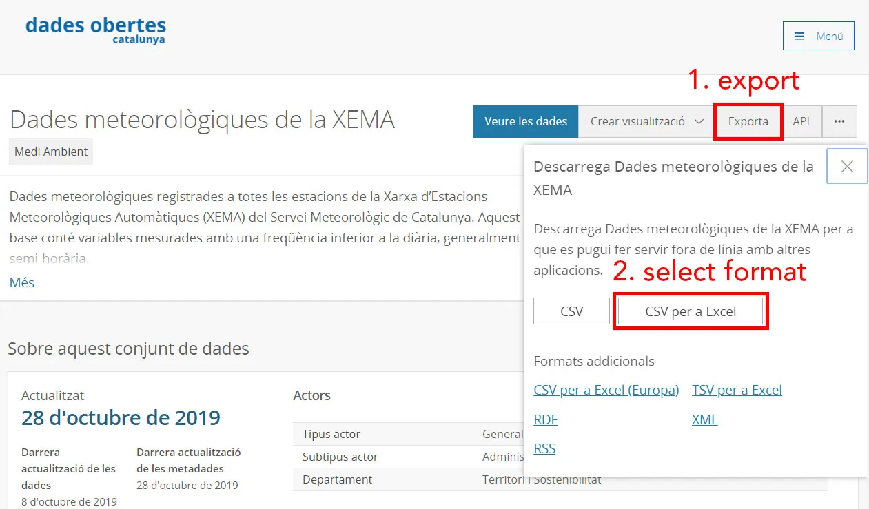
Overview
This post about pyspark will work with one example that should be too big to work with pandas.
Be sure to read Pyspark Intro before proceding with this post.
Get data
For this example we need to download a table that is really big. We would use open data from Catalunya.
This dataset is quite big, it might take some hours to download.
It consists of 3 csvs:
To download first click the Exporta button then CSV per a Excel.
Work with pandas
Usually the first things is to read a chunk of data with:
pd.read_csv(c.URI_CSV, index_col=0, nrows=1_000_000)And in one second you can have data 1 million rows into memory. But if you try to read the whole file you will probably run out of memory.
Pandas developers suggest that you have between 5 to 10 times as RAM as the file size. Since the file is 22GB you should have more than 110 GB of RAM.
But fear not, you can work with pyspark which way less memory. I was able to everything in my computer with only 16 GB of RAM.
Check data
You can read the whole table with spark and it will be really fast (only some seconds):
sdf = spark.read.csv("Dades_meteorol_giques_de_la_XEMA.csv", header=True)Remember that spark is lazy.
It won’t do anything until you call an operation that requires to do calculations.
Some of those could be sdf.show, sdf.toPandas or writing a file.
Let’s try to count the number of stations:
sdf.select("CODI_ESTACIO").distinct().count()This took around 6 minutes. As you are probably thinking this is slow.
The problem is that we are reading from a csv which is a really inefficient file format.
Let’s transform it to parquet which is way better.
# This took me 17 min with a Solid State Disk (SSD).
sdf.write.format("parquet").mode("overwrite").save("weather_data.parquet")
Remember to load the dataframe from the parquet file to see the performance improvement.
Read data
Now is possible to do things like counting the rows or the number of unique stations without spending too much time.
Explore possible partitions
It is a good idea to store dataframe in parquet by partitions.
Usually they are partitioned by date.
But what is important is that you partition by a column that you will usually filter or aggregate.
You should never choose a partition column that has a lot of unique values since it will mean a lot of files.
Using station column
By counting the number of rows by station we can see that:
- there are 212 stations
- they are more or less equally distributed
So this is a good column to use for partitions
Using variable column
This is another valid column for partition.
But since we are going to do analysis filtering by station it is better to partition by station.
Using both station and variable column
In this case the results are worst. The problem is that using to partitions is only useful if there are really a lot of rows.
In our case it ends up using 2 times the space disk as the file partitioned by station.
| partition | unique partitions | disk usage [GB] | writing time [min] |
|---|---|---|---|
| station | 212 | 2.56 | 30.28 |
| variables | 26 | - | - |
| station + variables | 2893 | 4.44 | 60.6 |
Explore data
Now that we have the data properly stored let’s do some exploration. First remember to load the data from the partitioned file.
If we take a look at basic operations we can see that the performance is similar as the one before setting the partition.
However if we work with data from one partition the performance will be way better.
Explore one station
First let’s explore the table with the definitions of the stations.
Since I have a home at a small town called Ulldemolins let’s try to find it.
sdf_stations = timeit(spark.read.csv)(c.URI_STATIONS, header=True)
sdf_stations[sdf_stations["NOM_ESTACIO"].startswith("Ull")].toPandas()
This gives 5 results.
Two of them are from Ulldemolins, one station that was closed on 2008 and the new one with the code XD.
So let’s join the tables with the data and the one with the variable definitions.
sdf.createOrReplaceTempView("data")

sdf_vars = timeit(spark.read.csv)(c.URI_VARS, header=True)
sdf_vars.createOrReplaceTempView("vars")

ulldemolins = spark.sql("""
    SELECT d.DATA_LECTURA as datetime, d.VALOR_LECTURA as value, ACRONIM as acr, NOM_VARIABLE as name
    FROM data d
    LEFT JOIN vars v
    ON d.CODI_VARIABLE = v.CODI_VARIABLE
    WHERE CODI_ESTACIO = "XD"
""")
ulldemolins.createOrReplaceTempView("ulldemolins")
Now if we do a count of this new table with ulldemolins.count() we can see that is really fast (0.59 s).
The thing is that spark is only accessing one partition so it does not need to load a lot of data. It is only working with 2.8 million rows which is only 0.78% of the original data (360 million rows).
Explore temperatures of one station
Let’s keep only max temperatures (encoded as Tx) and min temperatures (as Tn).
To filter it you can:
sdf = ulldemolins[ulldemolins["acr"].isin(["Tx", "Tn"])]The result has only 356255 rows. So it is safe to transform to pandas to continue the exploration. However let’s work with spark to practice a little bit more.
First let’s extract the date from the datetime.
To do so we need to create a udf and then apply it:
@udf(StringType())
def get_day(x):
    """ Parse date and extract day """
    return pd.to_datetime(x).strftime("%Y-%m-%d")

sdf = sdf.withColumn("date", get_day(sdf["datetime"]))
Finally we can extract average min and max temperatures for each day. This will make the table even smaller.
df = sdf.groupBy(["date", "acr", "name"]).agg({"value": "mean"}).toPandas()
df = df.sort_values("date")
Now we can create a plot with the min and max temperatures.
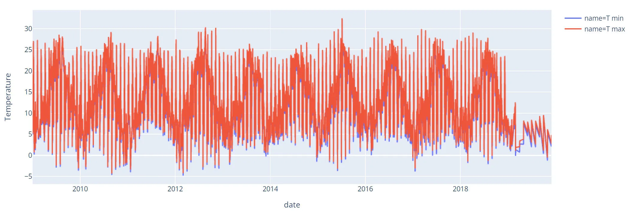
Some thoughts about the plot:
- It seems that 2019 data is not good (missing values).
- If you zoom in you will see that there is some kind of pattern for the days.
Let’s check it out.
Explore problem with temperatures
Let’s create a column with the month and one with the day in order to pivot the table.
df["day"] = df["date"].str[-2:]
df["month"] = df["date"].str[5:-3]

df_avg = df[df["acr"] == "Tn"].pivot_table(
    values="avg(value)",
    index="month",
    columns="day"
)
Let’s plot this pivot table:
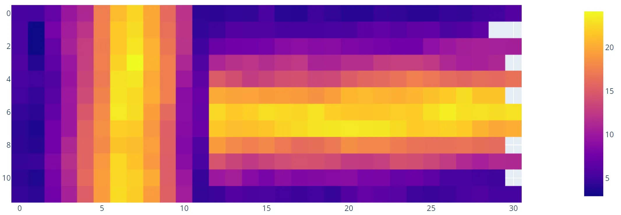
And now the problem looks obvious.
The data from the first 12 days is odd it is like it has been turned 90 degrees.
And it is indeed because we parsed incorrectly by confusing months and days.
Explore data parsing it correctly
The only thing needed to fix the problem is to pass day=True to the function pd.to_datetime.
So the udf should look like:
@udf(StringType())
def get_day(x):
    """ Parse date and extract day """
    return pd.to_datetime(x, dayfirst=True).strftime("%Y-%m-%d")
By doing the same the plot now looks this way:
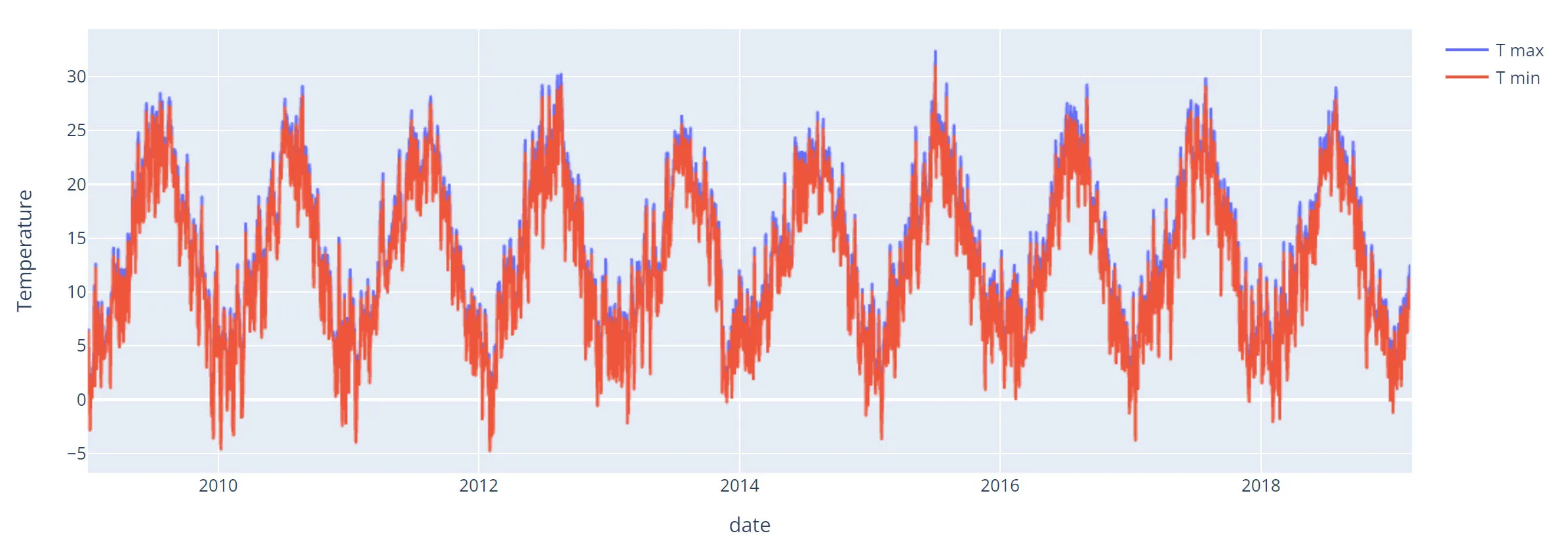
And it looks way better. There are no missing points in 2019 and the plot is more smooth.